> For the complete documentation index, see [llms.txt](https://docs.questera.ai/llms.txt). Markdown versions of documentation pages are available by appending `.md` to page URLs; this page is available as [Markdown](https://docs.questera.ai/questera-ai-sdks/all-components/embedded-analytics.md).
# Embedded Analytics
Leveraging Data for User Success
Harness the power of personalized analytics to optimize usage and discover untapped features, while setting and tracking performance benchmarks for continuous improvement and engagement.
### Line Chart
* **Optimization of User Engagement:** Track user activity trends over time to identify peak performance periods and areas for improvement. Harness personalized analytics for deeper insights into user behavior.
* **Discovery of Untapped Features:** Visualize the adoption rates of different features within your platform. Identify underused tools that could enhance user productivity and satisfaction.
* P**erformance Benchmarks Tracking:** Monitor progress against key performance indicators. Set benchmarks to achieve and surpass through continuous operational enhancements.
### Scatter Chart
* **Correlation Between Feature Usage and User Success:** Analyze the relationship between the frequency of feature usage and user performance metrics. Identify patterns that signify high engagement and success.
* **Impact of Analytics on User Performance:** Scatter plot showcasing the impact of personalized analytics on improving user outcomes. Spot which analytics features correlate with higher efficiency and satisfaction.
* **Benchmark Achievement Scatter Analysis:** Display the distribution of user performance against set benchmarks. Use data points to determine where users are exceeding or falling short in their goals.
### Line Styling
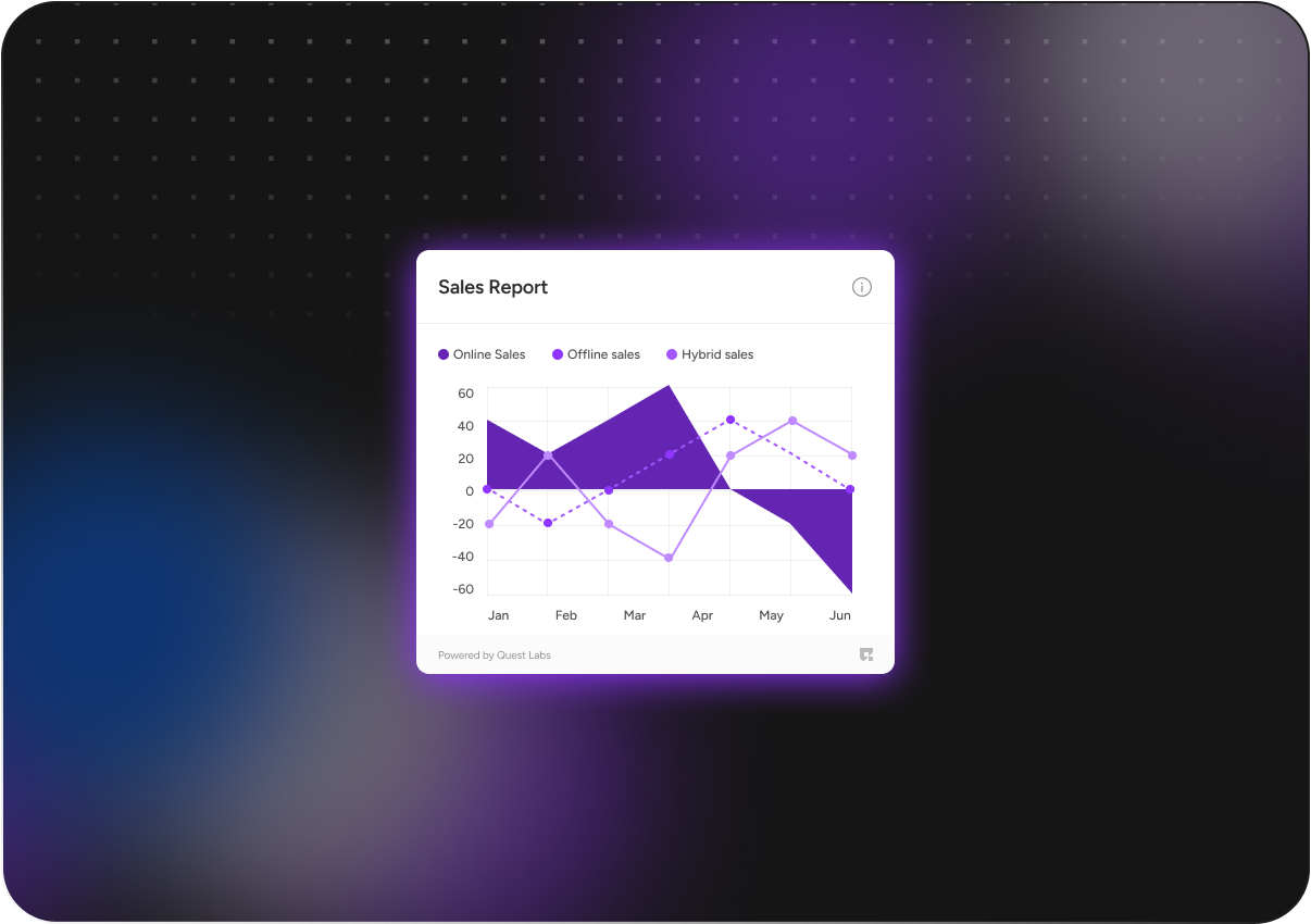
* **Custom Line Colors to Highlight Trends:** Utilize distinct colors to differentiate between various data sets. Enhance visibility and understanding of key trends that influence user success.
* **Dash Patterns for Data Differentiation:** Implement dash patterns to represent different types of analytics data. This helps in quickly identifying and comparing feature usage and performance metrics.
* **Line Thickness for Emphasis:** Adjust line thickness to emphasize significant data, such as peak usage times or major performance improvements. Thicker lines draw attention to critical insights and achievements.
### Combo Bar/Line
* **Feature Adoption and Usage Trends**: The bar chart shows the adoption rates of new features; the line graph tracks overall user activity over the same period. Analyze how new tools impact user engagement.
* **User Success Metrics Over Time:** Combination chart depicting growth in key performance metrics alongside user engagement levels. Benchmark success and identify areas for strategic improvements.
* **Efficiency Gains Through Analytics:** Visualize efficiency improvements as bars, with user satisfaction trends overlaid as a line. Understand the correlation between analytics use and user success.
### Stacked Bar Chart
* **User Engagement by Feature**: Examine how different user segments interact with various platform features. Highlight areas with potential for increased engagement and optimization.
* **Feature Adoption Over Time:** Track the growth in usage of new features across different user groups. Identify trends and opportunities for promoting lesser-used capabilities.
* **Benchmark Achievement Levels:** Display the progress of different departments or teams in meeting their performance benchmarks. Use data to drive strategies for continuous improvement.
### Horizontal Bar Chart
* **Feature Utilization Efficiency**: Compare the effectiveness of different platform features in enhancing user performance. Highlight areas where embedded analytics have maximized efficiency.
* **Incremental Performance Improvements:** Showcase performance improvements over time with analytics interventions. Track how embedded analytics contribute to user success and platform growth.
* **Engagement and Retention Metrics:** Illustrate user engagement levels across various segments. Use data to pinpoint where personalized analytics have bolstered retention rates.
### Stepped Line Chart
* **Step-by-Step User Engagement Analysis**: Observe step changes in user engagement levels over time. Use data-driven insights to implement targeted strategies for boosting activity and retention.
* **Feature Adoption and Exploration:** Highlight the stepwise increase in the adoption of new features. Pinpoint opportunities to promote lesser-used functionalities for enhanced user experiences.
* **Benchmark Achievement Tracking:** Monitor performance through distinct stepped intervals. Evaluate effectiveness of interventions to meet and exceed established benchmarks for success.
### Pie chart
* **Feature Utilization Breakdown**: Explore the distribution of feature usage within your application. Pinpoint which tools are most and least utilized to guide future enhancements.
* **User Engagement Levels:** Analyze the segments of user engagement across your platform. Identify which sections attract the most attention and which need reevaluation.
* **Benchmark Achievement Overview:** Display the proportion of performance goals met versus those still pending. Utilize this data to motivate continuous improvement and user success.
### Doughnut Chart
* **Feature Usage Distribution**: Explore the proportion of feature utilization across your platform. Gain insights into high and low usage trends to drive focus on personalized user training.
* **Engagement Levels by User Segment:** Analyze engagement across different user segments. Use this data to tailor experiences and boost satisfaction and productivity for each group.
* **Benchmark Achievement Overview:** Visual representation of performance against set benchmarks. Identify areas exceeding expectations and those needing improvement for strategic action.
### Multi Series Pie
* **User Engagement by Feature**: Examine how different user segments interact with specific features. Personalized analytics spotlight the most and least used aspects of your platform.
* **Feature Adoption Over Time:** Chart the growth in feature usage across various user cohorts. Highlight trends that point to successful integration or potential areas for enhancement.
* **Performance Benchmarks by User Group:** Compare key user groups against performance benchmarks. Use data-driven insights to tailor improvements and boost overall engagement.
### Bubble Chart
* **Feature Utilization Analysis**: Compare the usage intensity of different features across various user segments. Larger bubbles indicate higher engagement, highlighting key areas of user interaction.
* **User Success Hotspots:** Identify which analytics tools are driving the most significant performance improvements. Bubble size reflects the impact on user success and operational efficiency.
* **Benchmark Achievement Insights:** Track and visualize progress toward performance benchmarks over time. Bubbles represent the degree of goal attainment, facilitating targeted strategy adjustments.
### Floating Bar Chart
* **User Engagement Optimization Levels**: Illustrate the range of engagement scores before and after implementing analytics. Highlight the shifts in user engagement to pinpoint the effectiveness of personalized insights.
* **Feature Adoption Spectrum:** Display the spread of feature usage across different user segments. Identify which features are widely adopted and which remain largely untapped, guiding targeted improvements.
* **Progress Towards Performance Benchmarks:** Showcase initial and current performance metrics in a comparative format. This visual tracking aids in understanding how close users are to reaching established success benchmarks.