> For the complete documentation index, see [llms.txt](https://docs.questera.ai/llms.txt). Markdown versions of documentation pages are available by appending `.md` to page URLs; this page is available as [Markdown](https://docs.questera.ai/questera-ai-sdks/react-sdk-components/user-assistance/help-hub-component.md).
# Help Hub Component
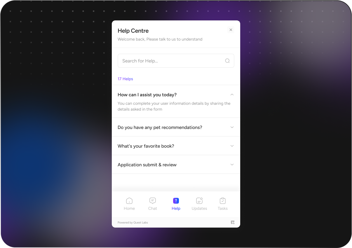
The Help Hub component is a user interface component that offers a comprehensive help center feature within your application. It provides users with access to information, an AI chatbot.
To unlock early access to the component [**Get Access**](https://bijfwfnqtsj.typeform.com/to/eUXDpbuh)
## Component Visuals
{% tabs %}
{% tab title="Overview" %}
{% endtab %}
{% tab title="Visual 1" %}
{% endtab %}
{% tab title="Visual 2" %}
{% endtab %}
{% tab title="Visual 3" %}
{% endtab %}
{% tab title="Visual 4" %}
{% endtab %}
{% tab title="Visual 5" %}
{% endtab %}
{% endtabs %}
{% hint style="info" %}
To unlock early access to the component [**Get Access**](https://bijfwfnqtsj.typeform.com/to/eUXDpbuh)
{% endhint %}
## Demo
{% embed url="" %}
## Installation
To install the `Quest react-sdk` into your project, follow these steps:
* Open your terminal/command prompt.
* Navigate to your project's root directory using the `cd` command if you're not already there.
* Run the following command to install the `quest-sdk` package using npm:
```jsx
npm install @questlabs/react-sdk
```
> This command will download and install the package and its dependencies into your project.
{% hint style="info" %}
Make sure your project has npm and Node.js installed, and that you have the necessary permissions to install packages in your project directory.
{% endhint %}
#### Props
The `HelpHub` component accepts the following props:
* `userId` (string): The user's unique identifier.
* `questId` (string): The quest identifier.
* `token` (string): Authentication token for accessing the help center.
* `headBgColor` (string, optional): Background color for the header.
* `headColor` (string, optional): Text color for the header.
* `backgroundColor` (string, optional): Background color for the component.
* `color` (string, optional): Text color for the component.
* `description` (string, optional): Description text displayed in the component.
* `onClose` (function, optional): A function to be executed when the component is closed.
#### Internal Components
The `HelpHub` component internally uses the `HelpChat` component to provide a chat interface for interacting with an AI chatbot.
#### Example Usage
Here's an example of how to use the `HelpCenter` component in your React application:
```javascript
import { HelpCenter, QuestProvider } from '@questlabs/react-sdk';
function App() {
return (
{
// Handle close event
}}
/>
);
}
export default App;
```
#### Component Behavior
* The `HelpHub` component integrates the `HelpChat` component internally to provide a chat interface.
* Users can search for information by typing in the "Ask a question" input field.
* Users can interact with the AI chatbot by clicking the "Ask AI" button.
* The component displays a list of helpful links based on the provided data.
* Users can click on the links to open them in a new tab.
#### Customization
You can customize the appearance of the `HelpCenter` component by providing optional props such as `headBgColor`, `headColor`, `backgroundColor`, `color`, and `description`.
#### `HelpChat or Ask Ai`
The `HelpCenter` component also provides chat section to facilitate user interactions with the AI chatbot. The `HelpChat` component allows users to send messages, receive responses, and view the conversation history.
***
This documentation outlines the purpose of the `HelpHub` component, describes its props, provides example usage, explains its behavior, mentions customization options.